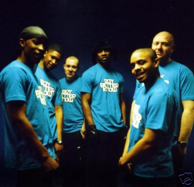
Here is a picture of the grime group 'Boy Better Know'. They are from London and are the UK's leading grime group. All the members of the group are looking towards the camera which is direct mode of address and this will attract in the audience's. This is a great picture as it shows the whole group, the colours stand out to make it look attractive to the audience and they also have their logo on their t-shirts which promotes the group as a whole. This would be a great picture to put on the front of a magazine or CD as it shows the audience just what their group is about even though they are just standing together.

Here is a picture of one of 'Boy Better Know's' album covers. This is a really good picture as the colours are bright and lively which makes it stand out and invite the audience in to look at the CD. It has the grime group on the front cover so audiences will easily recognize who's CD this is. Again they have the logo on their t-shirt which promote their group as a whole and they also have the name of one of their songs as the title of the CD which id 'Too Many Man'. This is a very popular song around the world and the music video shows the whole group in a club looking how they look on the front cover of the CD. Once again they are all looking towards the camera so this shows direct mode of address and will attract the audience in.

This is the official 'Boy Better Know' logo and it is used in all of their music videos and magazines/CD covers to promote their group. It is very simple which is a good thing as more complicated logos can be too much for a person to take in. This can also be bad as some people might see it and think it is too simple and therefore boring. The colour of the logo differs from the one above. This one is black, white and blue. These again are very simple colours but they change depending on the backgroud or the CD/magazine they are publishing. Here is their logo again but with different colours and a different background:
This logo is very different from the other as its colours have changed and gone more comple to match the background which again has gone more complex and complicated. In my opinion this logo is much better than the first one we have seen.


No comments:
Post a Comment